Marc J. Cohen has a soft spot for book publishing
WRITTEN BY:
February 3rd, 2010
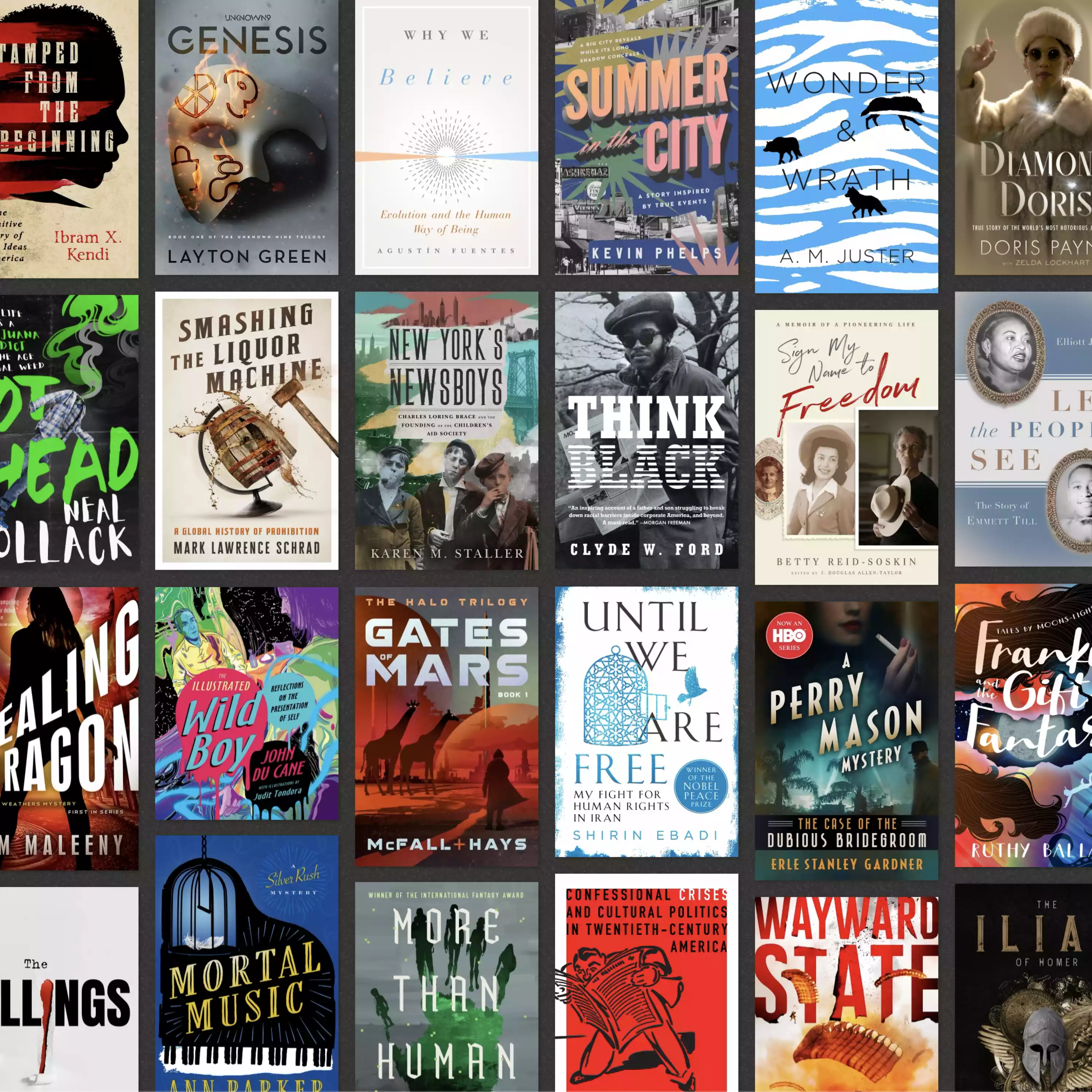
Marc J. Cohen is a book design icon. There was a time, in the 1980s and '90s, when it seemed like every other cover on the shelf was created by Marc Cohen and art directed by Susan Mitchell.
Growing up in Manhattan, I have fond memories of my father and I running around New York in a blue pickup truck, delivering proofs to clients. I remember stopping by various studios to show clients silkscreen proofs of their art. They would critique or accept the proof, and we'd be on our way back to the studio.
The studio was Rosepoint in the Dumbo district of Brooklyn. And unbeknownst to me, Cohen's office was downstairs. My father did book-cover work for Cohen for a brief time, and my father and I often scoured the bookstore shelves looking for my father's covers. In the process, we'd come upon a million other covers done by Cohen, and my dad would quickly point them out.
So perhaps there exists a bias in my perception of the sheer volume of Cohen covers I have come upon in my life, but nonetheless, the man has had a prolific book-design career.
All silly stories aside, I have always enjoyed the various recognizable aspects of those covers. They seemed quickly produced - and I mean that in a good way. They had all the elements of a good cover: great image, strong type and composition, etc. But above all, they were interesting to look at. They often contained hand-done type, cascading letter forms, collage-like picture arrangements, and so many other wonderful nuances that publishers no longer seem to take chances with.
And that saddens me, because I look at that "old" work and I feel as if a certain innocence has been lost. These days, designers and publishers tend to over-think the book-cover design process. Too many people are involved in the creation, and the end result is that many book covers wind up looking calculated. They lose their charm as pieces of art and become perhaps what they have had to become in today's economy: commercial books. The need to have all of the elements follow a certain template or prescribed look has made the bookstore shelf a bland mirage of sameness.
Alas, I digress. My primary desire in conducting this interview was to get a glimpse of what made that Cohen/Mitchell combo such a powerhouse. Because even today, as I browse the bookstore shelf, I find myself staring hard at a Cohen cover.
Give us a little background on how you started doing book-cover design. Where did you study? Name some of your design inspirations and influences. What were some defining first jobs?
I received a B.S. in biology from the University of Pittsburgh, with a minor in chemistry. My intention was to go to medical school. But I had always taken art courses and did a lot of sculpture. In my senior year I decided to apply to med school and art school, figuring the decision would be made for me. I was accepted to both, and after much soul-searching, art school won out. I completed my degree at the Tyler School of Art in Philadelphia in two-and-a-half years while working as a medical illustrator. Medical illustration quickly became boring, so I returned to New York.
At Tyler, my biggest influence was one of my professors, Stanislaw Zagorski. He was a great illustrator and a Time Magazine cover contributor. He forced me to think and rethink everything I worked on. Busted my butt.
One time, he was critiquing my work and with a sweep of his hand, my project - a book cover - fell from the board and hit the floor. It lay there as he continued his negative commentary. It might still be there.
I started shopping my portfolio around and received my first assignment from Bob Ciano, an art director at The New York Times. I got the job at 11 a.m. on Wednesday and had to have concepts to discuss four hours later. The finished art was due by noon Thursday for the Sunday edition. And this was my first job!
Now for the juicy stuff. Tell us what led to your amazing working relationship with legendery designer Susan Mitchell. How did it happen, what were the highlights and how did it end?
After freelancing for a two-and-a-half years, I got a call from Barbara Bertoli at Avon Books. I don't remember meeting her, but I must've dropped off some of my work. At that time I was doing a lot of hand lettering for magazines, along with illustrations. She offered me a designer's job over the phone. So I went to work for Avon Books, my first (and last) staff job.
After about 10 months, I left Avon with a couple of art directors - Carol Inoue and Lem Rauk - and we opened a design studio called Visible Ink. We had different viewpoints, but we were all focused on book-cover design and we worked well together. It was at this time that I met Sarah Eisenman at the publishing house Knopf. She was a wonderful art director who always seemed to give me the right projects. Through Sarah I met Susan Mitchell, who was three doors down the hall.
Working with Susan was one of the most amazing, intense, difficult and creative times of my life. I once described our relationship as Siamese twins constantly yelling at each other. She called me to work on a new line of books that Vintage wanted to produce that would be an imprint called Vintage International. The authors included Albert Camus, Thomas Mann, Vladimir Nabokov, Gabriel Garcia Marquez, Marcel Proust, V. S. Naipaul and many more.
Susan and I put an enormous amount of effort into trying to create a flexible design that worked within a branded identity. Each author had to have a strong sense of individuality without compromising the Vintage International look and feel. We explored the use of subtle textures and patterns as backgrounds or within the illustrations themselves. I remember Susan and I showing a printer comps of the tone-on-tone techniques we'd developed. At first all he said was, "You can’t get that on press!” But he did.
What was the developmental process behind the various cover designs? Obviously you worked with illustrators, designers, etc., but the covers all have a certain sensibility about them. In no other way can I describe it than, "Looks like a Cohen cover." There was a time when it seemed that every other cover on the shelf was done by your studio. Did you manage every title that came through, or did you give a lot of freedom to the designers you worked with?
We tried to find and create art that had never been used on books before. We used copy machines to make many of the illustrations. Photographer Barnaby Hall became a tremendous asset - and a hell of a lot of fun to work with.
Remember, there were no computers to create these looks back then. Everything was done by hand - and educated guesswork. Susan was relentless. Each cover had to be part of the series but still allow the author his or her unique quality. We produced 56 covers for the first list, and 20-something for the next and future lists.
The studio consisted of a mechanical artist and me. Some of the mechanicals were extraordinary pieces of art themselves. We also worked closely with a silkscreen company called Rosepoint for color comping. I moved the studio to be downstairs from their office so I could manage the jobs more efficiently.
There are way too many incredible covers that came out of that relationship. What are your three top covers, and why?
We did many covers for what we called "The Black Cloud List." These remain some of my favorite covers: The Stranger by Albert Camus, the Yukio Mishima series, Lolita and Look at the Harlequins by Vladimir Nabokov, Confessions of Zeno by Italo Svevo, Nobody Know My Name by James Baldwin, and The Invisible Man by Ralph Ellison.
What are you up to these days? One of my hopes for this interview is to get a good sense of your career trajectory.
Although I got my start in book-cover design, I have since worked in many areas of design and corporate marketing. I've created sales and marketing programs for magazines, financial services companies, and industrial firms. I produced all of the introduction marketing materials and video for The Sunday Wall Street Journal, as well as the AXA financial materials when AXA took over Equitable Life. I’ve also developed pharmaceutical communications and designed theatrical posters.
I still have a soft spot for book publishing, and I still design many covers. Sometimes I miss the complexity and detail of the old ways of working, but it’s certainly easier to make changes these days. Sometimes it’s too easy, but that’s another story.
Your time is quite appreciated, as are your mind-blowing contributions to book art and design. You will not fade from our memories anytime soon. Thanks most sincerely, Marc.


